Search

Tabbed block

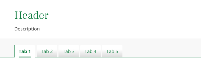
What is the tabbed block?

The tabbed block allows users to navigate between different views within the same context, without leaving the main page.

Tabs can help organise a page by chunking content into smaller pieces instead of showing it all at once thereby reducing cognitive load.

Anatomy

Tabbed block

Image showing a tabbed block

Specification

  • Header (optional)
  • Description (optional)
  • Header style (strong, faint, white)
  • Tab style (strong, faint, white)
  • Tabs (required)
 

Usage guidelines

Do's

  • Use tabs to show content that is in context to the main page but doesn’t need to be shown at the same time
  • Ensure the tab is correctly labelled to describe the content contained within 
  • Tab labels should be succinct (one or two words) to ensure they are easily scannable
  • Try to keep content within tabs short and to the point. They should be treated as a section of the page, not to contain an entirely different page
  • Ensure that the content outside of the first (default) tab is supplemental rather than critical as the user will have to actively switch back and forth between the other tabs to see this content

Dont's

  • Never use just one tab, the minimum requirement is two tabs
  • Never use tabs if the content needs to be viewed at the same time. You will be forcing the user to continually switch back and forth between tabs to see information. This will cause you to strain the user’s short-term memory and provides a bad experience. Use concertina’s if this is the case
  • Don’t use tabs as a shortcut to package large pages into a something smaller. Consider whether tabs are right for this content or if it should be separate pages
  • Don’t house content that is not related to the label of the tab
  • Try to avoid using tabs where there is a need for more than five tabs. Consider other ways of presenting the content